How to Hold On to Clients Who Reach Your Law Firm’s Landing Page
Tick. Tock. Tick. Tock. Someone clicked your law firm’s online ad and made it to your landing page. Now you’ve got 0-8 seconds to solidify their interest — or lose them — according to Kissmetrics, a customer engagement firm.
You practice law every day, not marketing, so your first question is: What’s a landing page?
It’s a web page that stands alone, separate from your website, and receives people who clicked your digital ads. It has one purpose and one purpose only: to turn web browsers into leads by enticing them to contact your firm.
But time’s running out. You better have a smart and strategic landing page.
This post will show you six key elements of effective landing page design:
- A clear course of action.
- Bold buttons.
- Simple design.
- Easy-to-use forms.
- A consistent message.
- A thank you.
1. Provide a Clear Destination for Legal Clients
You sit down at a restaurant. They hand you the menu. It’s like a book, pages and pages of options. We’ve all been to restaurants like this.
Having so many options, your decision is harder and it takes longer.
Maybe that’s OK for a leisurely meal, but not on a landing page, where the clock is running.
On a landing page, you want to give the reader a single, clear course of action.
As Oli Gardner, co-founder of unbounce, a technology company that focuses on landing pages, once said, “One Page. One Purpose. Period.”
Most of the time, for law firms, the purpose is to compel readers to contact the firm.
So limit their options and direct them toward the goal of becoming a new client.
One way to maintain this focus is to remove any header like the one you might have on your regular website.
That header could include menus or tabs that offer alternative paths, inviting the reader to wander away. Take away the distractions.
Look at this landing page for Five Stars, a company that focuses on customer loyalty programs:
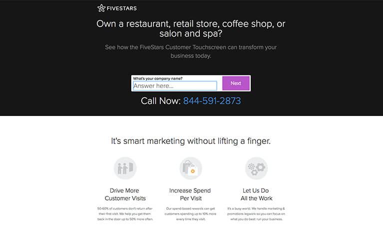
Source: Five Stars
Note that Five Starts cuts the traditional navigation bar that you find on their website. They also provide a clear objective, to learn more about their service by contacting them.
Examples for lawyers could be “Free Consultation” or “Get Started Now!” buttons.
2. Make Your Law Firm’s Call to Action Loud and Proud
The opposite of too many options is not providing a call to action at all.
Amazingly, some pages do this.
Take a look at this example we found on the web. Your eye goes to the black box that looks like a button. But it’s not a button. There’s no predominant call to action, or CTA.
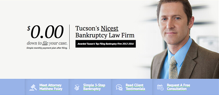
Source: Inbound Law Marketing
Don’t make your users dig. Your CTA button should have a bold color making it unmistakable.
And make it clear to users what they’ll get when they click.
Here’s a great example. A vivid purple button attracts your eye immediately. And you know if you click, you’re getting a free consultation.
Source: Inbound Law Marketing
3. Simplicity Rules on Your Legal Landing Page
In our continuing quest to cut distractions, lose any fancy animations or elaborate graphics.
You’ve already brought your client to your landing page. You’ve impressed them enough to get this far. No need to dazzle them with bells and whistles.
Keep the focus on guiding them to the step you want them to take.
You need to include a few essential items:
- Who you are
- What you do for the user
- What they’ll get by clicking through
One way you can get a little more sophisticated without compromising simplicity is by adding a video.
Videos offer another kind of experience, letting users visualize your message.
According to Brian Lovell, founder of the creative digital agency RED Interactive Agency, who spoke at the Behave Conference in New York, a well-crafted, meaningful video conveys urgency and immediacy in a simple, uncluttered way.
For it to be most effective, make sure your video parallels your call to action.
To add even more punch to your video, make it a testimonial or review from a client, which increases your landing page’s credibility, said another speaker at the Behave Conference, Liat Kornowski, social media director at Refinery29, a media company focused on women.
Using YouTube as your video platform is another key strategy in deploying videos. It allows retargeting, so after they watch, you can reconnect with your audience by sending more messages to them.
Codecademy, a company that teaches people to write computer code, provides a simple landing page that gets right to the point. It’s clean. It clearly states what they do and what you’ll receive.
Codecademy also gets bonus points for having a video and personal stories with photos.
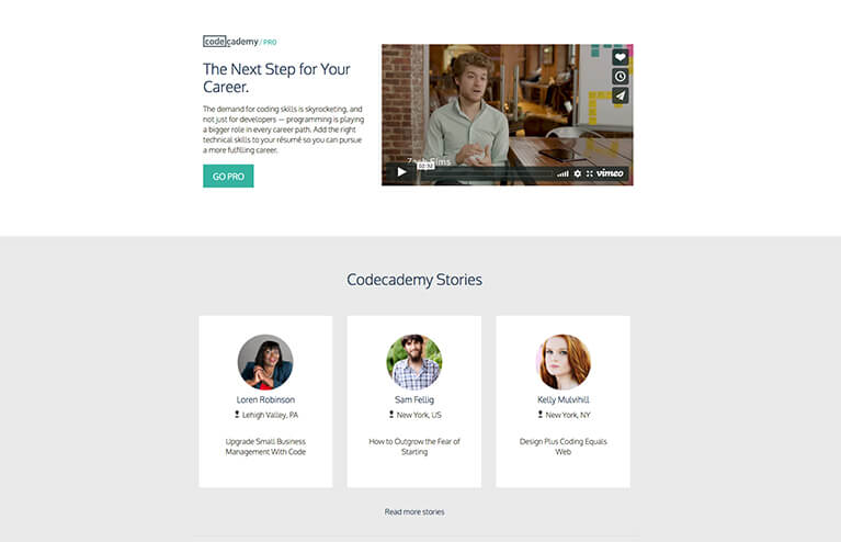
Source: Codecademy
4. The Art of Designing Forms for Law Firm Landing Pages
Ultimately, the success of your law firm’s landing page comes down to the forms people fill out and submit. It’s where the decision happens, so you’ve got to get the design of those forms right.
Once again, simplicity is key. On a form, that means not too many fields.
According to the online advertising firm WordStream, once people get past seven fields on a landing page form, they start to give up and drift away.
And in the visual look of your form, white space is your friend. It’s clean and crisp. It’s easier on the eye of your user.
Other visual elements draw their eye in the direction of your call to action, and white space helps those elements stand out.
And most of all, when you’re making a landing page form, design it for mobile devices.
We’ve crossed the tipping point where a majority of web searches are happening on smartphones. In fact, a site that reviews web hosting services, Hosting Facts, said about 75% of people in the United States access the internet on mobile devices.
Your law firm’s landing page forms need to snap seamlessly to the shape of smartphone screens.
Forms also give you an opportunity to test what works best for your audience. Run an A/B test with a couple different versions of your form. You can learn how your audience responds and where they spend the most time on your page. Then keep improving.
California Personal Injury Attorneys provides an example of strong form design on a landing page.
The objective is clear, to receive a free consultation. There’s a bold call-to-action button. The form only has four fields. And it’s mobile friendly, making it easy for the user to fill out.
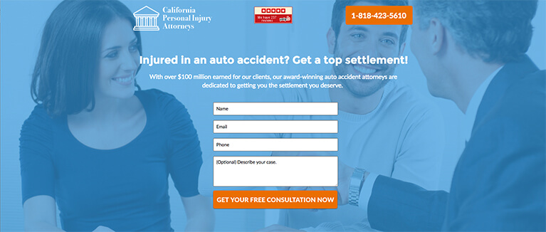
Source: California Personal Injury Attorneys
5. Keep Your Law Firm’s Message Consistent from Your Ad to Your Landing Page
If you tell them one thing in the ad and then serve them something substantially different once they get to the landing page, readers will get frustrated or confused and leave.
You need to make sure to match your messages, especially from your ad to the headline on your landing page. That way you reassure readers that they’ve come to the right place.
See these examples:
Message Mismatch:
Ad: Get your FREE Personal Injury Consultation Today!
Landing page headline: Kentucky Lawyers Serving Kentucky People.
Message Harmony:
Ad: Car Accident Injury Attorney. Don’t Let Insurers Play Games.
Landing page headline: Get a Kentucky Car Wreck Lawyer, So Careless Drivers Won’t Push You Around.
When your messages match, and people get what they expected, they’re more likely to proceed toward becoming your next client.
6. Simple Courtesy Goes a Long Way
In all the strategizing about making the perfect law firm landing page, don’t forget the magic words, “Thank You.”
After a web searcher fills out and sends your form — officially turning into a lead for your firm — you automatically send them to a thank you page.
It’s just plain polite.
But it also opens another door to more conversations. On your thank you page, you could guide your new lead to helpful resources you’ve posted on your website.
End this online interaction by leaving a positive impression.
Make Your Law Firm’s Landing Pages the Best
The clock is ticking, but clear directions, bold and unique CTAs, minimal design, strategic forms, matching messages and a simple thank you work together to create landing pages that grab the attention of your audience immediately — and inspire them to reach out to you.
One way to ensure you’re getting all of this into your landing pages is to work with a legal marketing agency like Firmidable. From the ads themselves, to the landing pages, to the overall strategy of your online campaign, we can make sure you’re maximizing the opportunities you get out of your advertising spending.
For help with your law firm’s digital ads and landing pages, email us at Firmidable or call today: 504-525-0932.
Firmidable is the nation’s best legal marketing agency. We know more than anyone else about how Americans choose their lawyers.
About the Author: Ellie Platt
Ellie Platt is the art director at Firmidable. She’s the guardian of branding for dozens of law firms, giving them instantly recognizable logos and visual identities that cement the connection between firms and new clients. She designs law firm websites, TV graphics, billboards and more. Ellie has over 10 years of experience in graphic design and marketing, including five years in legal marketing and previous work on billboard campaigns for multiple, big name brands. She even designed a replica football field built near the golf club home of Clemson University’s head coach, a tribute that attracted national news coverage.